Explore data: the basics
- Former user (Deleted)
- Becca Wilson
Reading in data
Tip: Comments
Remember to comment your code e.g.
#this is a comment
or even create code sections e.g.
###################################
#NEW SECTION
###################################
- look up the
read.csvfunction in the help file to learn how to read a .csv data file into R (web manual page).
?read.csv
- read the data in and assign the data a name e.g. file1
file1<-read.csv("ukgas.csv")
- you will see the newly created
file1variable in your top right Environment window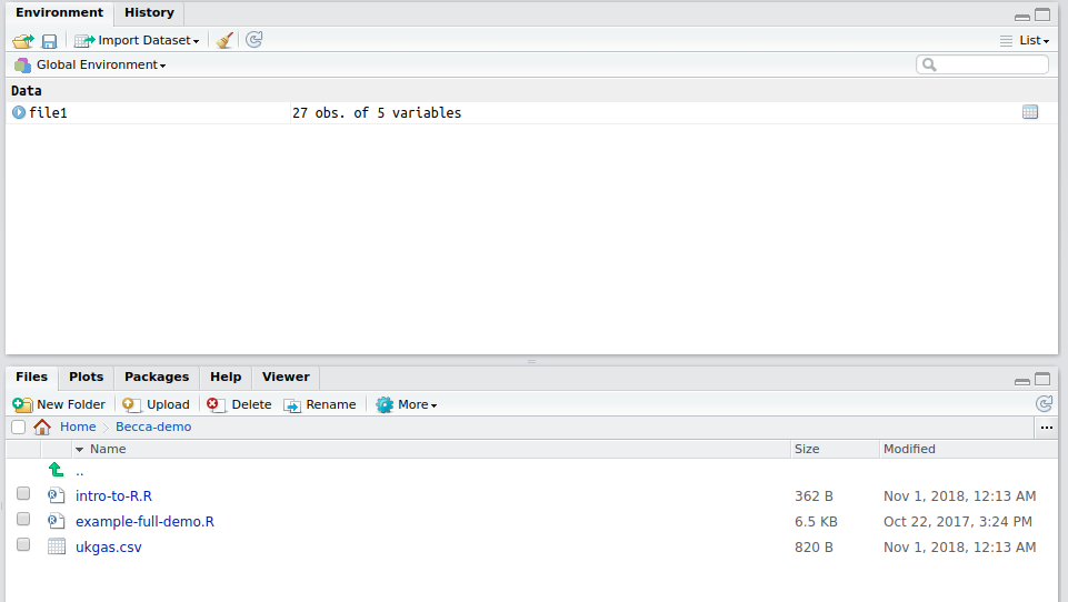
Exploring the data
- In your script, comment what the following commands do:
file1 # this displays all data in file1
head(file1) # this displays xxxxxxxxx
tail(file1) # this displays xxxxxxxxxxxxx
file1 [1,] # this displays xxxxxxxxxxx
file1[1:5,] # displays xxxxxxxxxxx
file1[,1] # this displays xxxxxxxxxxxxxxxxxx
file1[,1:5] # this displays xxxxxxxxxxxx
file1[,'year'] # this displays xxxxxx
file1 [,'qtr1'] # this displays xxxxxx
<- or =
You can assign your selected data to a new variable name using <- or =
year <- file1[,'year']
qtr1 = file1[,'qtr1']
It is best practice to use <- to assign a value to a new variable x rather than = which implies x equals the value. = is typically used to denote arguments within functions.
Plotting data
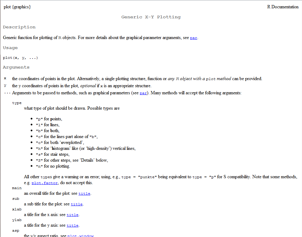
- In R open up the manual page for the
plotfunction:
?plot
- make a basic plot. This will automatically appear in your plot window in the bottom right quadrant of R Studio.
plot(x = year, y = qtr1)
- use the
typeargument to change the plot to lines - search the manual for the
parfunction - this allows you to set additional parameters in graphs. In the manual page search (using Ctrl F) for the wordcolor.Find and implement the argument for plotting colour - make your plotting colour ‘red’.
Writing the data
- printing to file requires opening a graphics driver (e.g. pdf, png, jpg), the plot to be defined, and then once you have finished printing to file this device driver needs closing.
- Open up the manual page for the png function to find out how to apply the function and then write the plot to file.
?png

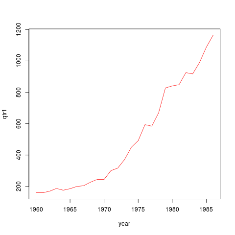
png(file="plot1.png") # opens the png printing driver, output to appear in plot1.png
plot(x = year, y = qtr1, type = 'b', col = 'red') # this plot is printed
dev.off() #prin driver closed
- A .png will appear in your working directory viewable in bottom right quadrant in R Studio
Tip: Printing a .pdf
A pdf output can be printed using:
pdf (file="plot1.pdf", h=7, w=12)
#where h is height in inches and w is width in inches
plot(x = year, y = qtr1, type = 'l', col = 'red')
dev.off()
Beautifying plots
R plots in layers. You start with a base plot using the plot function and then can add layers of extra data, regression lines, legends, text equations etc on top of it using:
- points()
- text()
- lines()
- legend()
- abline()
- Open up the manual page for
pointsto learn how to add additional data to a plot. - Use
pointsto add qtr2 data points to the qtr1 graph. Remember you will need to assign your qtr2 data to a new variable before you can plot it.
#look up points in help file
?points

#assign qtr2 data to variable called qtr2
qtr2 = file1[,'qtr2']

#plot qtr 1
plot(x = year, y = qtr1, type = 'l', col = 'red')

#add qtr2 data
points(x = year, y = qtr2, type = 'l', col = 'black')
Tip: points()
The arguments that can be applied in the points function are very similar to the plot function.
- Open up the manual page for the
legendfunction. Use the information to add a legend to the plot.
#look up points in help file
?legend


#assign qtr2 data to variable called qtr2
qtr2 = file1[,'qtr2']

#plot qtr 1
plot(x = year, y = qtr1, type = 'l', col = 'red')

#add qtr2 data
points(x = year, y = qtr2, type = 'l', col = 'black')

#add legend
legend(x = 'topleft', y = NULL, legend = c('qtr1', 'qtr2'), col = c('red', 'black'), lty = 1)
- Add qtr3 and qtr4 data to the plot. Print the final plot to file.
Tip: Full plot
You will see that qtr 3 plots data off the y axis. Use the min and max functions respectively to identify the min of qtr3 and max of qtr1. Use the ylim argument in plot() to set the min and max y axis as the example below (denoted by i and j, respectively).
plot(x = year, y = qtr1, type = 'l', col = 'red', ylim=c(i,j))
points(x = year, y = qtr2, type = 'l', col = 'black')
points(x = year, y = qtr3, type = 'l', col = 'blue')
points(x = year, y = qtr4, type = 'l', col = 'green')
legend(x = 'topleft', y = NULL, legend = c('qtr1', 'qtr2','qtr3', 'qtr4'), col = c('red', 'black', 'blue', 'green'), lty = 1)
info: Answer script
You have now completed Exploring the data: the basics. Make sure you:
- comment your script appropriately
- save your script somewhere sensible
- your script should be similar to the example answer script.
Related content

DataSHIELD Wiki by DataSHIELD is licensed under a Creative Commons Attribution-ShareAlike 4.0 International License. Based on a work at http://www.datashield.ac.uk/wiki